

Wednesday, 21 September 2011


Monday, 23 May 2011
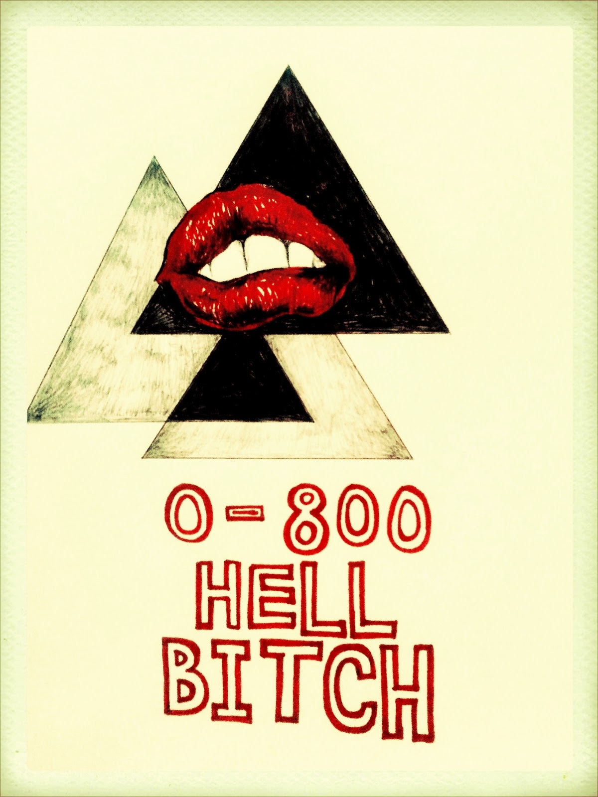
screenadelica


Screenadelica 2011 was an exhibition of gig posters, held in an empty building on Slater Street that used to house the International//Art Organisation Gallery. Most of the posters were on sale, and you could select a design and have a t-shirt screen-printed for you at the event. There were some bands, and a bar. I think the more I think about my practise, the more I realise that this is the kind of event I want to be involved with, more than I want to make work that is viewed as "fine art." The line between a graphic product and a fine art object has never really existed to me, and I think the images on display at Screenadelica were every bit as worthy and compelling to me as anything else. Hopefully it'll be a taste of the kind of experience I'll have when I start graphics/illustration in September. I'd definitely seek this kind of outlet for my work more readily than I'd use a white gallery wall again.
Wednesday, 11 May 2011
dormitorium

I really enjoyed this exhibition, Dormitorium by the Quay Brothers, in the Victoria Gallery. It functioned as a good introduction to their work, which I thought was halfway between David Lynch and Tim Burton. They capture a sense of the cartoonish and morbid that I often try to achieve with my drawings, although obviously their vision is much more fully-formed and accomplished. The space was very darkly lit and quiet, and all the cabinets were their own self-contained little universe or vignette. It was a real testament to artworks potential to transport, inspire and move us through a commodity of means.
introspective/relationships
"Relationships," held in the Liverpool Academy of Arts, was the largest of the student shows arranged as part of the Practise and Publication module. I liked many of the works on show a great deal, and I felt a lot of it was very poignant and worthy. I did however think that the space itself felt sort of characterless, and few of the works engaged strongly with the idea that their artwork was being produced for a specific display space. This is something I feel guilty of with how I chose to display my own artwork, too, however, so I have no real right to criticise.
The works produced for the second show of that evening, "Introspective at the LSU," felt more successful, with a slightly stronger sense of identity and shared ethos. All the works in the small, office rooms, felt really accomplished and were, at times, very captivating. Rachel's films combined to menacing effect, Tasha's installation was otherwordly and ominous, and Louise's room was a really artfully combined and poignant arrangement of objects, tones and moods. These works probably went the furthest in overcoming the flat, empty atmosphere of the Student's Union.
I think maybe some other works weren't serviced the best by being displayed in the SU. Freya's work is something I rate and always enjoy seeing, but I thought the lighting and atmosphere of the room it was displayed in was just too flat and sparse to do it justice. It's one of my favourite works produced by my peers, but I'd be dishonest if I said I could totally overlook its display environment in appreciating it. I had similar feelings about many of the more wall-based works, but I'm aware that the logistics of displaying in an SU must have been quite hard to deal with. None of the work was inherently flawed, in fact I thought it was all really good, it's just that the space still felt officey. I had to deal with similar annoyances displaying in the Corke gallery.
One thing that I felt all the works benefited greatly from was the friendly, fun atmosphere of the show. It was easygoing and casual in the same sense that "Mementos" was, and it's something that not all of the exhibitions I've been to this year have shared. It goes a long way to making an experience memorable, and I think during the course of "Introspective," the LSU definitely housed a lot of worthy and enjoyable opportunities for memorable experiences.
electroma

After Mementos, Matt had his projector and speaker set-up left in our house for a period of time. We decided to watch Daft Punk's Electroma on the big screen, with a totemic arrangement of candles on the floor underneath for effect. It was a throwaway idea, but it actually came to change how I viewed the film really significantly. They gave the film a sense of time, place and tangibility that became really integral to my enjoyment of it. The film has no dialogue, and the largeness of image teamed with the candles made it profoundly visual and moving. Artworks exist outside the self, but our experiences of them ultimately always boil down to context and our specific state of being as we view them. Watching Electroma really crystallised the importance of these aspects of creative practise to me.
roots

Roots opening, overall, went well and as planned. Getting the work arranged in the space was a relatively easy, pain-free experience, as I had a really good time working with the other three students exhibiting. I think their work was of a high standard, and I was proud to exhibit with them. They all did their work justice, and we put on, what I'm told, was quite a slick show.
In retrospect though, I'm not convinced I felt totally proud of what I produced for the Corke gallery. The 15 framed works I had worked well as a unit, but I thought they felt unnatural and out of place on the stark, white Corke gallery walls. I was assured by Nic Corke that the display wall would be painted and the pictures straightened, so when I arrived on the opening night to find that there were still pencil marks on the walls and all the pictures were at angles, I felt quite let down. Nic, in fairness though, wouldn't have done this due to neglect or dishonesty - he showed a real enthusiasm and interest in working with us, and I liked working with him. The fact that my pictures jarred in the space, I think, had more to do with my expectations of them, and was an issue to do with own artistic discretion. The lighting and atmosphere was something that I should have made it my business to think about before I put the works in there, and I think I was complacent in thinking that they would work in that context.
My envelope wall was popular but I felt I copped out by taking money from people for them. Charging £2 seemed nominal in the abstract, but when it came time to actually take the money I just felt a real sense of guilt. Seeing the money pile up in a jar just seemed obscene to me, and if I had to change one thing about the show, I'd have made the envelopes free from the start. One feedback that I've got from people is that they've pinned their envelopes up on pinboards or on fridges, and I like that idea a lot more than I like the idea of having had my works on some walls for a period of time.
I think I learnt a lot about my real value as an art practitioner through Roots. I don't disbelieve in the concept of a white gallery wall, but I do think that my work demands a context beyond that to really be at its best. Putting my work on the walls felt a bit like a perfunctory, shallow decision, and if I'm honest, I didn't put a great deal of thought into how it would all look in situ. If I was to display again in the future, I'd think more laterally in how to best put across a sense of myself in how I present paintings and drawings to an audience or viewer.
mementos

Mementos was an exhibition by Pip Dye and Matt Weir held in 10 Edge Lane, in my house. Mementos has probably been my favourite of the student-led exhibitions this year. The works, that both address a sense of nostalgia and memory, felt appropriate in the dilapidated, high-ceilinged, sparse spaces. Pip and Matt were forced into using the house because their arrangement with Casa de Brujas fell through, although I think Pip's work especially felt much more natural and believable in a home setting. Matt's films were accomplished and immersive, and I think the sit-down viewing format worked in their favour. There was an easy-going atmosphere to the event that was unlike any other exhibition, as we were all amongst friends, at home, and drinking. The bonfire was a particularly appropriate touch - they evoke a certain kind of warm reminiscence that, I thought, was a really astute addition to the evening. One to remember.

Monday, 21 March 2011
one last never


All my work is now in the Corke Gallery. 70 of my envelopes are now pinned to a board, there'll be 100 in total at the opening, and then Nic wants more to replenish the supply after the first few nights. They're now £2; Nic felt £1 was too cheap. I think £2 is reasonable - not extortionate, as they're all hand-drawn, although it doesn't feel like I'm giving them away. Hopefully people won't be too put off by the price to have a go and buy one.
I've chosen quite a kitsch, chintzy layout for the framed works. It's a symmetrical arrangement a bit like you'd find in a living room, to add to the sense of conflict between the presentation and the content. I've titled them all "Never," other than one work called "Always." Overall I'm quite pleased with the quality of the show as it stands. The other artists work is all of a really good standard, and the space isn't so crowded with works that you can't appreciate each piece individually. "Roots" is a really varied show, and I'm pleased that we have such a broad mix of practises to display. I'm optimistic that people will enjoy it.
Friday, 18 March 2011
never, obviously


This is the material I'm handing over to Nic Corke tomorrow to be put up in the gallery. I've got around 70 envelopes and 15 framed works, although I'm hoping to bring another 28 envelopes along on Tuesday just to round off the total to 100. I think the hodge-podge, gaudy set of frames I've used has worked quite well, and the drawings now function as objects as well as just drawings. I think especially putting smaller drawings in large frames really draws the eye to them and makes the viewer focus on the detail I put in. I think the overall tone of the series is what I was aiming for, and I do view them as functional collectively as well as individually. The notion of "Never" is prevalent, and I think I'll title all the works "Never" other than the small drawing of the cat and mouse, which I'll title "Always."
The bedsheets are from Ikea, if you were wondering.
Wednesday, 16 March 2011
re: action


RE:Action was the first of the exhibitions arranged as part of our Practice and Publication module, with work by Dave/Amos Whiteley, Catherine Rockwood and Anna Mulhearne, in the Wolstenholme creative space. I was quite impressed with how slick the exhibition felt. The space really seems to lend itself to installation artwork, and while each work had its own tone, the three works together seemed to take on a single, more congruous meaning. There was a certain spooky, maudlin and quite serious sense of intent which, to me, was quite accomplished. The four individuals, engaged in their own individual therapies, felt sort of otherworldly, almost like a seance. The feeling of the space was meditative, with an allusion to neuroses and obsession present across all three artworks.

The works all invite subjective interpretations and explore our relationship with ourselves. To me, they functioned more as an intriguing series of vignettes more than anything overly philosophical, but I often find installation artwork very hard to engage with anyway. I think the nature of this response is something the artists anticipate and even welcome, as their literature suggests they value the individual's viewpoint as much as their own. Overall I thought it was quite a worthy, harmonious experience, and an interesting start to the run of shows.
Wednesday, 9 March 2011
pop isn't a dirty word

Pop is a lot to do with my artwork. The idea that pop can simultaneously be knowingly aloof and shallow, yet also be dense with imagery and more meaningful notions, is key in understanding my practice. My work is tongue-in-cheek and has no set definition, but I'm also very emotionally invested in it and like to think it carries some message about me, my ego or how I perceive myself.
On the broadest level possible, I think pop is the art of the thrill, and it's intrinsic in all branches of creative human endeavour. My artwork is visceral and always designed to be pleasing to the eye on some level - I have an enjoyment of line and colour that I think can be pretty universally appreciated. I think the small emotional thrill that people may get when viewing my work is, ultimately, the same kind of thrill that some people get when they watch a film, or maybe a music video, or hear a piece of music they find affecting. I don't like to view any experience of this nature as more worthy than another. My notion of pop is that if someone gets an emotional rush out an experience, we shouldn't feel the need to quantify its worth because of the means its creator has happened to use.
My work is, generally then, an arrangement of symbols. I think it's enough that a symbol or motiff can exist in an artwork without needing to be explicitly explained. Individual elements such as shading, the figures or text are what my drawings consists of, but they're mostly just my way of manipulating the tone of the piece. I have ideas about what a particular image may mean, but I don't think my view is definitive, as I can never totally understand how other people will perceive the work. I've always preferred to learn about the work through how it's received more than I've ever felt any desire to state its intention. Complete understanding of an artwork requires complete understanding of the self, which I personally think is impossible. We can approximate the process of stepping outside the self and self-scrutinising, but ultimately, it can only ever amount to an intellectualised facsimile. We're still the same mind; the same amalgam of memories and emotional triggers. I believe then that the breadth of an artists understanding of their own work can never be truly comprehensive.
Although I have no set-in-stone notion about the meaning of my artworks, I don't believe the images are created "automatically," because the idea of the "automatic" creation of artwork completely contradicts the works intention. Creating the artworks is a very involved, reactionary process of balance. I rarely have a set agenda for a piece, but I may have an idea for an element I wish to employ that then takes on a completely new meaning in the context of the piece as I create it. If the work is going too far in one direction, I'll often counterbalance it with an element that may contradict, or even undermine, the nature of the "message" so far. Doubt or scrutiny of the self is still a fundamental theme, and I feel any message I could put across that's too earnest or absolute would be, if anything, a bit dishonest.
The idea then of artists having any kind of authoritative voice, to me, is false. Artworks are, effectively, an experience, and often the true nature of the experience can become a bit muddied or diluted in its retelling. I think memory is often what we want it to be more than what it actually was, because to have and state an opinion is, by its very nature, an indulgence of the ego. We make statements about artworks because we're willing to be perceived as making those statements, and maybe sometimes we aren't truly honest, even with ourselves, with our feelings about an an artwork. I prefer not to state meanings because I think it tarnishes the overall potential of the work. Artwork functions as an invitation to a personal, subjective experience. In this sense then, I would definitely consider myself a "pop" artist, because whether the piece has worth depends entirely on the viewer. I don't like people to feel they don't understand a work because they don't understand my viewpoint - theirs is just as worthy as mine, ultimately. Pop is fundamentally a base attempt at emotionally moving an individual which is, I think, the best thing that could be expected of an artwork.
Monday, 7 March 2011
never never never never never never never


I've made about 40 of these envelopes now. I'm hoping to put some sweets and "wisdom" in them and sell them for £1 a go at the Corke gallery alongside my framed works. I'm emailing Nic Corke tomorrow, so I'll see whether he likes the idea and go from there. If he likes it, I'll have to think about how they're displayed and signposted. They've turned out to be very quick, so I'm hoping to make at least 100 for the exhibition, and maybe another 15 or so for the crit next Friday.
Nic has also asked for a personal statement. I wanted to get the gist of my practice across without coming across as too pretentious or obtuse. The theme of the exhibition has turned out to be "Roots," which I initially had reservations about, as it implies a sense of heritage which isn't really relevant to my artwork. On further reflection though, I decided that the idea of a "root," a hidden or buried source from which something more formed can automatically grow, is actually quite applicable. This is my statement for the Corke gallery:
My work is illustrative and relates to the human condition. The work is tongue-in-cheek, melodramatic and has no set definition, although I like to think it’s in some way reflective of my ego or perceived self. The drawings are an arrangement of symbols rather than a narrative. There is minimal agenda in their creation, and they are open to subjective interpretation. Generally the work explores notions like desire, anger and betrayal. The work links to the title of “Roots” in the sense that every emotion, and therefore creative action, has a subconscious “root” or origin in memory. These artworks evince that idea. The idea of “Never” is also central, as it’s something we all have to deal with.
Sunday, 6 March 2011
never indefinitely


Another work for the exhibition and some drawings on brown envelopes. I'd like to have a lot of the envelope pieces in the exhibition in some way, as they're quite quick and a bit of fun. I might put fortunes in them, or sweets. I'm using "Never" as the loose title and theme for the work I'm making. I feel it's something we all have to deal with.
Wednesday, 2 March 2011


Monday, 28 February 2011


Saturday, 19 February 2011
corke
 |
| Photo of the Corke gallery, taken by Will Facer |
I will be exhibiting work in the Corke gallery on Aigburth road with another student from the course, Will Facer. The Corke is a small, private gallery, with good light and white walls. I'll be exhibiting drawings in gold frames, and Will will be exhibiting photo-montage. Our artwork isn't directly related, although we both use graphic means to carry a broader artistic message. Nick Corke, the gallery owner, seems agreeable, so I don't think we'll have any trouble putting together a show of quite a good standard.
I'm also exhibiting as part of the exhibition in the Liverpool Academy of Art in town. This exhibition has a much broader mix of students in it, nearly 30 in total. I'll exhibit drawn works there too, although my concern is that it may be hard to stand out amongst such a broad mix of work. The theme is "relationships," and as my artwork is reflective and therefore a representation of my ego or perceived self, I think I'll fit the brief.
I had also been talking with a group about exhibiting in the Wolstenholme, although I was involved from quite a late stage. The Wolstenholme's atmosphere would have played quite well off my gold-framed drawings I think, with the ragged, run-down feel of the building maybe serving to heighten their sense of macabre. Unfortunately the Wolstenholme exhibit fell through, and the back-up option, the Students Union, didn't really strike me as appropriate for my artwork. The space has real potential to be transformed with installation or performance artwork, and I'm excited to see the show that will be put on there, although there were no spaces where I felt my drawings could be appreciated in the same way. The "office" feeling of the space was something that hanging a picture wouldn't really change, although other methods of presentation definitely could.
I also intend to exhibit video artworks as part of the art school dance, as I feel they're not too intrusive and will suit a more casual display environment.
Tuesday, 8 February 2011

nam june paik

I went to see Nam June Paik's "Laser Cone" in FACT Liverpool. Lying back and watching the visuals was a really novel, compelling experience, and it really showed the potential of more modern artistic media. The piece felt fun and not overly earnest, without the need for a deep concept or agenda. I like artwork that's direct in this way.

The work in Tate was more of a mixed bag. Paik's "TV Garden" was obviously quite special, and "One Candle" had a very simple, iconic feel. These instillation works presented a set of imagery that kind of put the question of the artwork's worth back into the hands of the viewer. This is something I've found tedious in the past, but Paik's visual language was one I could occasionally find myself quite absorbed in, more than say Tate's previous Rothko exhibition. I thought his "Aunt" and "Uncle" sculptures had quite a concise, simple message, and many of the more Zen-focused works felt quite witty and informed. The works that alluded to broader truths were the ones I thought were the most worthy.

I suppose now, because the art world is so saturated with video artwork, I found much of Paik's less sculptural work quite tedious and obtuse. I think that video collage, at any length, can be really boring without narrative. It's our natural instinct to piece together a narrative or meaning in what we're seeing, so it becomes a real effort to take in more ambient, abstract pieces like those in the upstairs of FACT. I rarely have the patience. The fault probably lies with me as the viewer, but in general, it's just not to my taste. Avante-garde is often accused of being a bit empty, and I felt Paik's works were in some ways indulgent and shallow a lot of the time.
I'm not sure whether seeing these works has made me think about what I plan to do with my own video works. Video artwork is different to film in that you absorb it in a much more casual sense, so I think that would have to be a consideration in whatever way I choose to display it.
Sunday, 6 February 2011

Monday, 31 January 2011
love me as i am

This is the first completed artwork that I intend to display for my Practice and Publication module. I've chosen gold, gaudy frames for a kind of "living room" aesthetic, and the work is in blue biro, which I think plays quite well off the gold. This should hopefully function quite well in drawing viewers' eyes in a gallery space. I suppose framing the work also heightens the sense of conflict between the lowbrow and highbrow aspects to my practise. I like the idea of putting drawings that are sort of crass, ugly and degenerate into frames that are sleek and a bit kitsch. Balancing the images between pop and fine art, and not letting the works become either too explicitly, is a constant concern.

Second work, slightly smaller scale.

Edit, 1/3/11: I decided to darken the red background of this piece so it would fit with the other works I plan to display better.
Sunday, 30 January 2011

Sunday, 23 January 2011


Tuesday, 18 January 2011
freelancing in the creative industries
The thing I thought this day of lectures highlighted most was the large disparity between the very safe, university art environment in which I'm practising now, and the much more business-oriented creative industry that I'll find myself in at the end of my degree. I think it reinforced my suspicion that I'll be more likely to find a niche or output as something like an illustrator much more easily than I'll successfully find my way onto gallery walls. It's made me further think about how I'll eventually have to pitch and sell my skills and artwork, and how I'll have to stand out in what seems to be a very large, competitive market. Ultimately though, I found the experience very tedious, and felt it was better suited to students in the more practical courses.
Subscribe to:
Posts (Atom)